
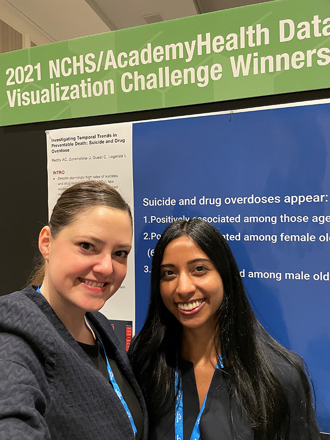
Laurel Legenza and Apoorva Reddy are recognized by the NCHS and AcademyHealth for their visualization of data on suicide and overdose deaths
By Brianna Foth
According to the Centers for Disease Control and Prevention (CDC), nearly 71,000 Americans died from drug overdose in 2019, with more than 70 percent of those deaths involving opioids. An additional 47,511 died from suicide, making both suicide and overdose leading causes of death in the United States. One concern for pharmacy researchers is the question of whether these two trends are related: recent research suggests that people who misuse prescription opioids may be as much as 40 to 60 percent more likely to have thoughts of suicide.
Wanting to further investigate and highlight the relationship between these two concerning trends, a team including two researchers from the University of Wisconsin–Madison School of Pharmacy created an interactive visualization of National Center for Health Statistics (NCHS) data on suicide and overdose deaths. That visualization went on to win them the 2021 NCHS/AcademyHealth Data Visualization Challenge, a national competition that invites participants to create interactive data visualizations using tables provided by the NCHS.
Laurel Legenza (PharmD ’13), director of Global Health at the School of Pharmacy and an UW Institute for Clinical and Translational Research (UW ICTR) postdoctoral fellow in the School of Pharmacy’s Sonderegger Research Center for Improved Medication Outcomes, and Apoorva Reddy (MS ‘20), Health Services Research in Pharmacy graduate student, collaborated with UW–Madison engineering graduate students Jared Zunenshine and Colin Guest, who graduated in 2021, to make up one of just two teams to win the 2021 NCHS/AcademyHealth Data Visualization Challenge.
People who misuse prescription opioids may be as much as 40 to 60 percent more likely to have thoughts of suicide.
“In our program, we study the psychological, social and economic factors that impact medication-related behavior, whether that’s medication use or abuse,” says Reddy. “So, it made sense for us to investigate opioid overdose and suicide, which are topics that come up a lot in our seminars.”
The challenge invites graduate student researchers and mentors from around the country to design an interactive visualization that displays NCHS data in a way that spotlights a public health trend or disparity that went previously unseen. Winners are selected according to several criteria, including relevance, accessibility, design, and creativity.
An important facet of the challenge is that it asks researchers to tell a story with the data, while also highlighting or identifying a problem that can be addressed with policy. Thus, the challenge requires participants to demonstrate one of the most crucial skills in pharmacy research: going beyond the theoretical to consider practical implications and solutions to real-world problems.
Identifying trends in preventable death
The UW–Madison team’s winning visualization, titled “Investigating Temporal Trends in Preventable Death: Suicide and Overdose,” features an interactive graph displaying suicide and overdose death rates over a 20-year period between 1999 and 2018. The graph’s interface allows the viewer to toggle between statistics for men and women, while also enabling the viewer to compare data between different age groups.
“We saw an appreciable distinction in the trends between age groups,” explains Reddy, who worked with Legenza as the team’s mentor to identify patterns in the data worth highlighting in the graph. “It’s interesting to look at how suicide trends are differing between age groups, and how overdose trends were also changing with those age groups.”
Importantly, joining the suicide and overdose trends together in the same graph allows the user to note places where the trends mirror one another. The rate of overdose deaths among men between the ages of 25 and 34, for example, reaches its highest point in the late 2010s before beginning to decline, coinciding with a peak and decline in the suicide rate for the same age group. It’s unclear whether these similarities are incidental, or whether they reflect that some of the overdose deaths in the NCHS data may have also been suicides.
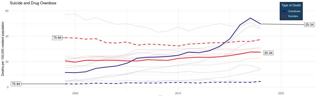
In analyzing the data, Legenza and Reddy also observed that the peak and subsequent decline of the suicide and overdose rates for the 25-34 age group appeared to coincide with the 2017 unveiling of a five-point opioid strategy by the U.S. Department of Health and Human Services, which included increased funding for efforts related to drug addiction treatment and recovery. This suggests that efforts to address the opioid epidemic may also play a role in helping to reduce the rate of suicide.
The research team realized, however, that the same downward trend did not occur for groups over the age of 65, suggesting that different response measures might be needed to target different age demographics.
“It’s intriguing to note that it had a different effect on different age groups,” says Reddy. “And you can see how policymaking efforts can have a strong effect.”
“Visualizations are a faster, easier, and interactive way to disseminate our results.”
—Apoorva Reddy
“The visualization highlights, specifically, which groups are at the highest risk for overdose and suicide,” says Legenza. “And from a policy perspective, if you have limited resources, interventions to help reduce those can be better marketed or targeted towards populations that have higher risk.”
The potential for the data to spotlight problems related to the opioid epidemic was also part of what initially drew the team to the NCHS datasets on suicide and overdose deaths. Opioid stewardship is an important part of pharmacy practice and research, and Reddy has previously done work on medication and illicit substance use and the association between health literacy, risk perception, and over-the-counter (OTC) misuse among older adults.
“Pharmacists play a big role in opioid stewardship,” says Legenza. “So that dataset definitely caught our attention for that reason.”
Cross-campus collaboration
Legenza credits Reddy for discovering the Data Visualization Challenge and initiating the process of putting a team together. The two quickly recruited engineering students Colin Guest and Jared Zunenshine; Legenza already knew them from taking a UW–Madison course together in data visualization with College of Engineering Professor John Lee, one of Legenza’s postdoctoral mentors. The Challenge presented a perfect opportunity to practice and expand on the skills learned in the course.

“We had a really good team for designing this visualization,” says Legenza, who thanks the engineers for taking on the difficult task of building and testing the web application that displayed the interactive graph for the challenge. The engineers, in turn, appreciate Legenza and Reddy for bringing valuable perspectives on medication safety as well as background knowledge of the opioid crisis.
“They understood the opioid crisis going on and how these drugs may be related to suicides and unintentional overdoses,” says Zunenshine. “So, their understanding of that aspect really made it easier to grasp what factors we wanted to focus on.”
“It was awesome to have everyone on the team working on different things, but also working together,” he says.
Looking forward
Having won the Data Visualization Challenge, the team now hopes that seeing their chart will inspire other researchers to recognize the unique ability of data visualizations to communicate findings in a more meaningful and interactive way.
“Data visualizations allow researchers to show what we do in a way that’s user friendly to the public, to policymakers, and to other people who may not be used to reading academic journals,” says Reddy. “Visualizations are a faster, easier, and interactive way to disseminate our results.”
It’s especially important for the viewer to be able to engage with the data in order to draw their own conclusions. Research suggests that interactive data visualizations can help viewers process information better, in part through allowing them to make their own choices in how they navigate complex information.
The UW–Madison team presented their visualization to data and policy experts across the health services research field at the 2022 Health Datapalooza and National Health Policy Conference in Washington, DC. At the conference, Legenza also presented her recent research with Zunenshine to create an interactive visualization of antimicrobial resistance data to aid antibiotic treatment decisions for healthcare providers, building on Legenza’s previous work to map resistance around Wisconsin.
With the competition behind them, Reddy is turning her focus to improving the clinical guidelines on cannabis use for patients with neurodegenerative disease, working with the support and mentorship of Assistant Professor Natalie Schmitz in the Pharmacy Practice and Translational Research Division and Professor Betty Chewning in the Social and Administrative Sciences (SAS) Division.
But working on their winning visualization has also inspired Reddy to continue experimenting with new ways to display data, including exploring new aspects of the same visualization the team designed for the challenge.
“Can we take what we did and build it in a new way? Or make it more advanced?” Reddy wonders. “There are so many different directions we could take it. This isn’t the end.”
Learn about Laurel Legenza’s (PharmD ’13) other visualization project: mapping antibiotic resistance.