Project with faculty participation has Wisconsin pharmacies re-thinking prescription labels
By Katie Gerhards
An older patient, who was beginning to experience dementia, also had perpetually restless legs, which would keep them from being able to fall asleep at night. the patient had a prescription for a medication to help quiet that disruptive feeling, but on the label — which read “take two tablets by mouth two to three hours before bed” — all they could see was the number “three.” The patient continually took three tablets.
After speaking with the patient and physician, Nicole Sandberg, a pharmacist at Ballweg Family Pharmacy, decided to rewrite her prescription label to make it clearer for the patient to understand: “Take two tablets by mouth two hours before bed.” With only one number present, the label was easier for the patient to digest, and she was able to manage her medications more easily.
Research shows that this experience is not uncommon, and patients themselves think it’s time for a change. A recent survey of state residents by Wisconsin Health Literacy (WHL), a division of Wisconsin Literacy, Inc., found that 88 percent of respondents found current medication labels confusing, and 23 percent reported having taken a medication incorrectly because of confusing labeling.
“As pharmacists, it’s easy to get so used to looking at our labels that we can forget they can be difficult for patients to understand, and the differences between pharmacies can further disorient patients,” says Sandberg.
The United States Pharmacopeia (USP) in 2013 released a set of standards for patient-centered prescription medication labels, General Chapter 17 in USP’s formulary, which focus on readability and clarity. To date, Utah is the only state to have formally adopted the standards.
“We frequently heard that there is just too much on the label for patients to understand, so they don’t even bother to look.” –David Mott
But a project led by Wisconsin Health Literacy with a range of collaborators, including University of Wisconsin–Madison School of Pharmacy Professor David Mott, is paving the way to get all Wisconsin pharmacies on board by creating a framework for implementation, which can help out-of-state pharmacies improve their labels, too. Their work earned a 2018 Pearl Award from the North American Primary Care Research Group and was selected as one of the top three out of 1,300 submissions.
“We want to get as many pharmacy partners as possible to modify their labels using our toolkit or implementation guide,” says Mott. So far 20 pharmacies have joined to redesign their labels, including Ballweg Family Pharmacy and major health system pharmacies like UW Health, Aurora, Froedtert, GHC-SCW, Mercyhealth, and Ascension.
The project, now in its third phase, has been in progress since 2014 and has already improved patient metrics.
Opportunity to improve labels
Prescription labels are intended to give patients the information they need to appropriately take their medication at home — yet until USP released their guidelines, they did not have a patient-centric design.
During early focus groups with the public, “we frequently heard that there is just too much on the label for patients to understand, so they don’t even bother to look,” says Mott. “Because they aren’t looking, they don’t know how to take their medications, and then a lot of times they just end up not taking it at all.”
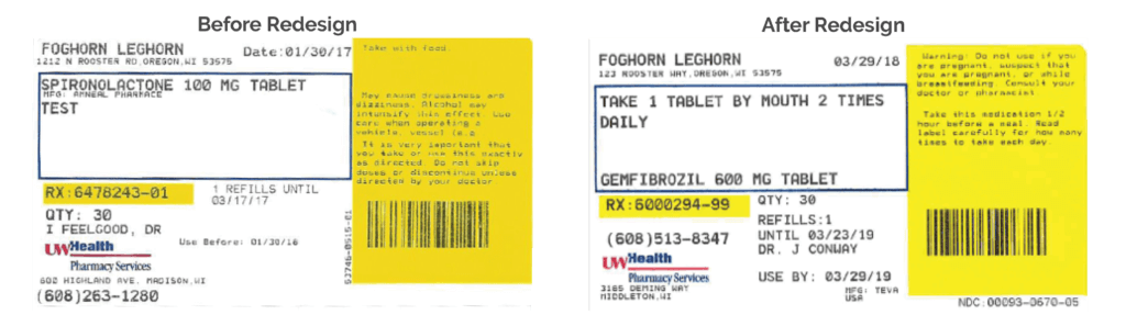
The USP guidelines address a lot of that feedback by suggesting simplified language, in the patient’s preferred language when possible; improved readability through using increased whitespace, contrast, and sentence case; and giving explicit instructions, among other standards. Instead of saying “take twice daily,” which leaves a lot of ambiguity — two at once? 12 hours apart? — the labels should say “take 1 pill in the morning and 1 pill in the evening,” for example.
In another survey of Wisconsin pharmacists by WHL, 85 percent of respondents supported a general adoption of the standards. So if they found value in the standards, why had they not been implemented yet?
“Even though the USP guidelines are out there, they haven’t really taken off because what we learned is that pharmacies don’t know how to make these changes,” says Mott.
Before they jumped into redesigning the label, they wanted to speak with various stakeholders — pharmacists, physicians, software vendors — to assess and account for the barriers. WHL saw that as an opportunity, applied for a grant from the UW–Madison School of Medicine and Public Health’s Wisconsin Partnership Program.
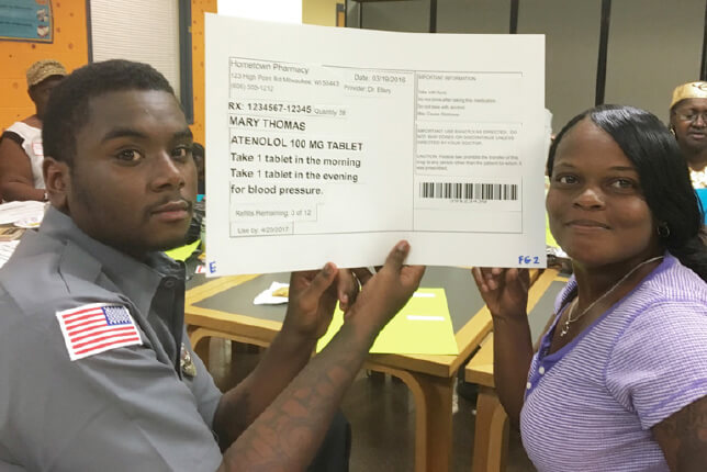
With that important context, the team then got funding from the Medical College of Wisconsin’s Healthy Wisconsin Partnership Program to find a test group of pharmacies willing to partner with the team to develop a process to change prescription labels. They recruited a 17-member Project Advisory Council, including Mott, and an 11-member Patient Advisory Council. Three pharmacy organizations jumped at the opportunity to get involved: Hayat Pharmacy, UW Health Pharmacy Services, and Hometown Pharmacy.
“A really cool part of this project is that a lot of the development and evaluation has actually been by patients,” says Mott. Surveys found that patients didn’t want to see addresses, confusing dates, all capital letters, and other clutter, instead preferring a cleaner layout that prioritizes the most critical information at the top of the label and includes a large font, white space, the name of the medicine, what it’s for, and the prescriber name.
“As pharmacists, it’s easy to get so used to looking at our labels that we can forget they can be difficult for patients to understand.”
–Nicole Sandberg
In one focus group, participants had to create their own label out of the dissembled parts typically found on a prescription bottle. “They showed us what would be the best label, and it’s completely different than what most labels look like today,” he says.
Using the USP standards and patient feedback the participating pharmacies redesigned their labels and put them to the test. In a survey, the results were clear: Only 13 percent preferred the old design.
Between the 67 participating sites in phase two, and the approximately 128 additional sites so far in phase three, at least 3.5 million prescriptions have already or will soon bear the new, easy-to-understand labels each year.
Evaluating the redesign
Using data from a Medicaid health plan and Hayat Pharmacies in Milwaukee, Mott and his colleagues evaluated the impact of the new labels on medication adherence by calculating the medication possession ration (MPR), which measures the number of days of medication supply against the number of days in the medication use interval.
“We could look at the period before and after [patients] received the new label and found that their adherence changed quite a bit.” –David Mott
“We knew when the labels were changed, so we could look at the period before and after they received the new label and found that their adherence changed quite a bit,” explains Mott. “It was statistically significant.”
The PMRs especially improved among oral contraceptives and medications for asthma and hypertension, with evidence of the most improvement among more vulnerable populations.
“Looking ahead, if these labels can improve medication adherence in groups with lower socioeconomic status and among older adults, who use more medications than any other group, this has the potential to be a game-changer for adherence as well as safety,” says Mott.
The incidence of patients calling the pharmacy for more instruction after returning home has dropped, too, indicating the new labels are providing what they’re intended to: clear information.
Expanding the impact
The three pharmacy systems in the trial each faced unique challenges that have provided insight as the project moves forward. For example, some current pharmacy software has limitations in font size and style, meaning some pharmacies using their services can use only all capital letters — in direct disagreement with USP standards.
Other pharmacies, such as Ballweg, have joined the effort but need to use up an existing stock of labels before ordering a new design. In the meantime, Sandberg and her colleagues are working on the education piece and are implementing some best practices — such as avoiding the word “once,” which in Spanish translates to 11, potentially creating extraordinary confusion for bilingual patients. UW Health faces limitations with the flexibility of their label software, but is also focusing on implementing best practices. “Our new labels are progress, not perfection,” says Melissa Ngo, pharmacy manager for UW Health community pharmacy services. “We’ll continue working to further improve them as much as we can.”

As the project evolves, the team is also working with Epic and some health systems in the state to pilot-test modifying the “sig,” which is the physician’s instructions to the pharmacist and patient about how the medication should be used.
“When physicians create a prescription, often times they’re selecting from a dropdown menu, and we want that menu to reflect the best directions from a literacy standpoint,” says Mott. “That’s an important step in this process to re-envision labels, because if they prescribe it with the right directions, they will transfer all the way down to the pharmacy, to the label, and into the patient’s hands.”
After that test, they will follow up with patients to see if they noticed the change and whether it helped them better understand their medication.
“Epic has been a willing partner in this because they realize that it’s a problem, and if they can figure out how to change it, then they can go to their clients around the world and offer them the option to tailor the software to their needs,” he says.
The team aims to wrap up the project next year. But before they do, they want to have 25 percent of Wisconsin’s pharmacies using their implementation system to redesign prescription labels and improve that aspect of patient care.
“We believe that having 25 percent of pharmacies on board will the tipping point, where the adoption of patient-centered labels develops into a standard pharmacy practice in Wisconsin,” says Kari LaScala, project manager and associate director at Wisconsin Health Literacy.
Learn how to get involved in the project.
Read about another label redesign aimed at increasing safety for older adults taking over-the-counter medications.